Toque Belga, a brand dedicated to the authentic Gaufre de Liège, needed a visual identity that would capture both tradition and the irresistible charm of its waffles.
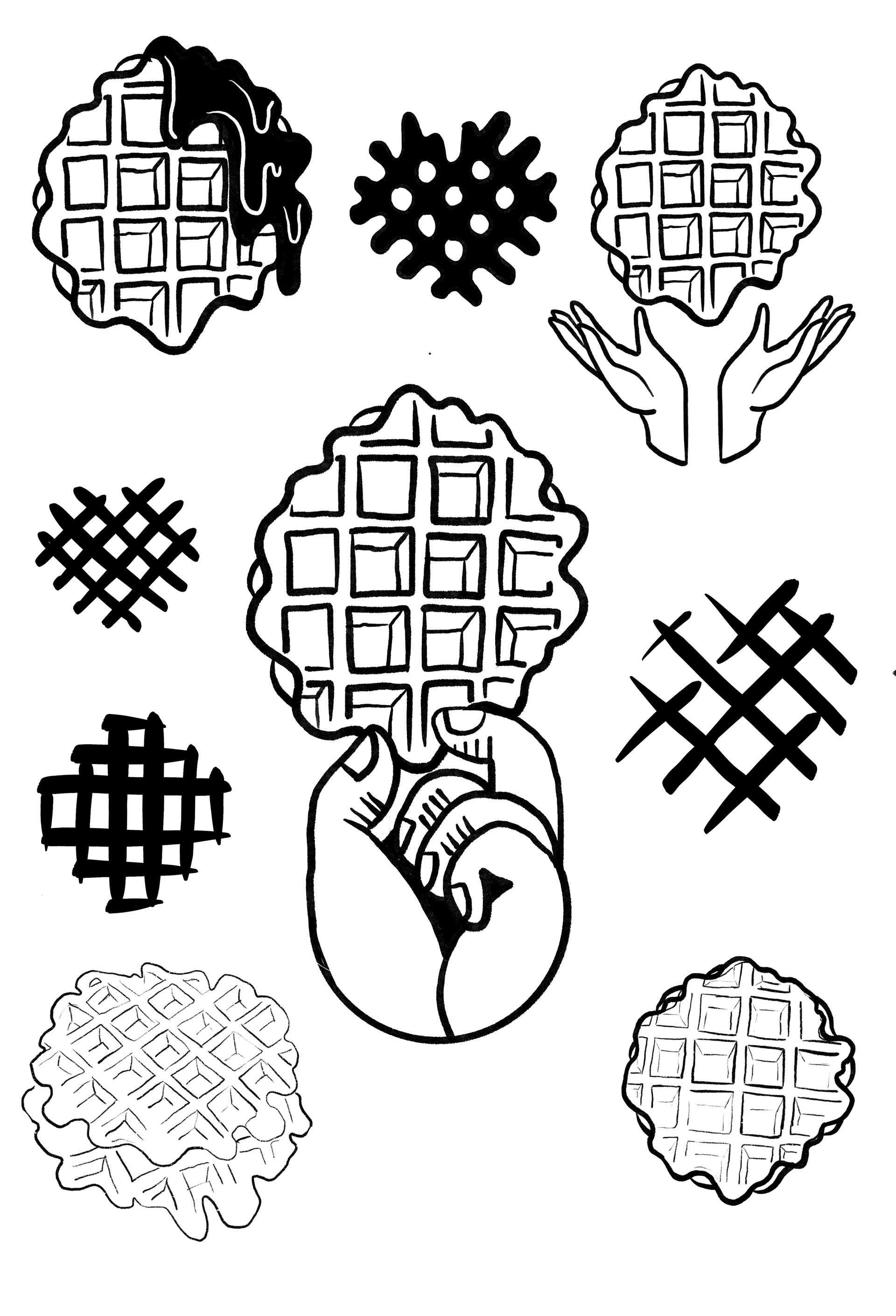
The logo is a clean, stylized representation of the gaufre, designed to highlight its iconic texture and form while staying versatile across packaging, social media, and promotional materials. Classic typography reinforces the brand’s heritage while ensuring clarity and consistency in every application.

To add more personality, I created custom illustrations inspired by the unique textures of the waffle itself. These details bring warmth and authenticity, enhancing the sense of craftsmanship at the heart of the brand.
The result is a visual identity that feels simple yet distinctive, one that sparks curiosity, whets the appetite, and tells a story of tradition, flavour, and quality in every bite.